The next time you pause before a quick meal or unwrap a familiar treat, take a closer look—you might notice there’s more going on than meets the eye. Many well-known brands build subtle
storytelling into their logos, using tiny design details to create emotional connections. These elements don’t shout for attention, but they quietly shape how we feel about the products we use every day, adding a layer of meaning that goes beyond function or taste.
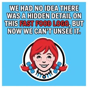
Take the logo of Wendy’s, for example. The friendly red-haired mascot has long been associated with comfort and familiarity, but careful observers have pointed out a small visual twist in her
collar that appears to form the word “MOM.” Whether intentional or simply a clever coincidence, the effect reinforces the brand’s message of home-style warmth. It’s a reminder that even fast food can be positioned to feel personal and nostalgic.
Then there’s Subway, where the arrows built into the logo serve a purpose beyond decoration. Positioned at opposite ends of the name, they suggest movement, direction, and choice—ideas that align with both the brand’s identity and the everyday experience of customers on the go. Similarly, Toblerone incorporates a hidden bear within its mountain graphic, a subtle tribute to its origins in Bern, Switzerland. These quiet touches don’t change the product, but they deepen the story behind it.
Learning to notice these details transforms how you see branding altogether. What once seemed like simple design becomes a form of visual storytelling, filled with intention and creativity. By slowing down and observing more carefully, you begin to recognize how even the smallest elements are crafted to resonate. In a world full of familiar logos, it’s these hidden nuances that make them memorable—and worth a second look.